Lets take a look at where we’ve come from in regards to mobility…
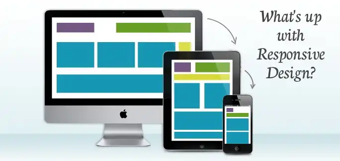
For the last few years, the web design world has gone through some drastic changes. One of which is known as responsive design. It’s the idea that when a website is designed, the developer should build the site to fulfill the scope of multiple screen resolutions such as the iPhone, iPad, and all of those in between. About 4-5 years ago, developers would approach this as a second thought. The idea was new and the iPhone just came out with a web browser that actually displayed the web like its desktop counter part. Therefore, why think about it? The iPhone displayed the page in its entirely. No loss, just requires to use of pinch to zoom to read it.
Before then, those with mobile Internet devices such as blackberry and windows mobile, would strip out most of the site design, almost taking us back to the 90’s. Apple’s mobile Safari was a game changer. It used the same driving engine from WebKit and processed the exact same website in your hands that you would have seen on your desktop computer. However with this great technology, users quickly found that reading on a small device was becoming trivial. Sure you could pinch to zoom and scroll around, but it wasn’t the same. Sometimes you would need to zoom, pan the screen left, move to the right, then pan back left to read the next line. Trivial.
The great minds then decided to create dedicated mobile versions of their website. This version would serve all the mobile devices on a separate domain, usually m.domain.com or mobile.domain.com. These worked well for what it was but soon after they too started to become a problem. Sometimes the mobile version would be incomplete, missing individual pages, or missing content. In addition, the developers had to manage two or more completely different sites, the main and the mobile. This cost time and resources, not too mention confusion as one article may not be on both sites.
Here comes Responsive…
Then we came to the view of being responsive. The idea was to make the the same exact website, with everything displayed, respond to a different browser size automatically. This became the perfect answer (so far). Serve the same webpage to all browsers including mobile and tablet devices, then just rearrange the content to fit the screen size. The developer would only need to make a single update and the change is served to everyone.
The way responsive is delivered is by altering the design CSS with media queries. These styles target specific browser sizes. For example if you use in your CSS:
@media only screen and (max-width: 480px) {
     body { font-size: 0.8em; }
}
Then all browser windows with a width meeting or smaller than 480px’s across will show the body font size at 0.8em instead of the typical 1em, or base font size, that might be used for the desktop version. This gave way to allowing developers to easily target and deliver custom styles based on the device’s screen size, regardless of what the device brand was.
By planning your website project for mobile devices at the beginning, the developer or designer would be able to adjust early on and format their content to meet all of the mobile possibilities including the desktop. Knowing and planning to use responsive styles to build your design, the developer or designer would be incorporating max-widths, percentages, EM’s, in addition the @media queries to build the site. Plan now and save time for the future.
Example Scenario:
Let’s take the following example. It’s from Natista, one of our HTML templates that we sell in our online store. It’s responsive and was built with the idea of working on all devices regardless of size. Let’s take a look at one of the design elements, the main menu. We knew that we wanted a menu that would respond to all views and still look and act like a menu.

We designed our menu to look the same, visually, even though it responds differently. We also clearly labeled our mobile menu to let the viewer know that this is a menu and you can click/touch it.
Another aspect of the above example, is the image slider (the cat that makes you go aww). The slider is from the well known Flexslider jquery plugin and automatically responds to the browser window size. In fact, the entire design of Natista does exactly this. All images use a max-width:100% css property and site layout uses a fluid grid system of percentages. Planning with these ideas will allow the entire site to flow to any viewer and any device.
Is 2013 the year of Responsive Design?
Given the rapid adoption of tablets and smartphones in the consumer market place and the fact that users seem to prefer reading their news, blogs, and favorite sites on the mobile web, I think it’s inevitable that 2013 will be the year that responsive design takes off. In fact look at all of the HTML and WordPress marketplaces, most if not all, of the templates for sale are responsive. Owners want it, developers want to build it, viewers want to use it!
Some Stats…
1) 1.08 of the world’s 4 billion mobile phones are smartphones. 3.05 billion are SMS enabled. (Source: Microsoft Tag)
2) Mobile internet usage is projected to overtake desktop internet usage by 2014. (Source: Microsoft Tag)
3) Apple and Android represent more than 75% of the smartphone market. (Source: comScore)
4) 74% of consumers will wait 5 seconds for a web page to load on their mobile device before abandoning the site. (Source: Gomez)
5) 46% of consumers are unlikely to return to a mobile site if it didn’t work properly during their last visit. (Source: Gomez)
6) 7.96% of all web traffic in the U.S. is mobile traffic. That number skyrockets to 14.85% in Africa, and 17.84% in Asia — up 192.5% since 2010. (Source: Pingdom)
7) 24% of US tablet owners use their tablets to shop 2-3 times per month; 20% use them to shop more than once per week; and 12% use them to shop every day! (Source: eMarketer)
8) Over 1/3 of Facebook’s users access Facebook Mobile; 50% of Twitter’s users use Twitter Mobile. (Source: Microsoft Tag)
Browser Compatibility
By now, all of the latest major browsers support Media Queries, CSS3 and HTML5. However, IE8 and older will need a little help from the html5shim or another equivalent plugin/script. So take the plunge, build quality responsive websites.